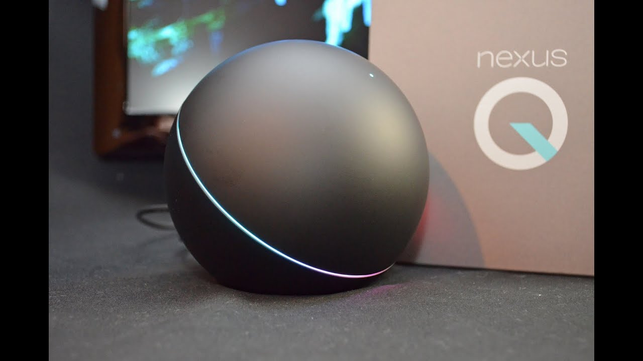
The Nexus Q has some pretty neat media streaming features, but is way too expensive–and the preview release is just plain buggy.
I finally got hold of one of the new Android 4.1 (Jelly Bean) smartphones capable of running the Nexus Q app you need to operate the preview release of the new Google media streamer–and a PC World colleague armed with a second Jelly Bean handset came by to help me test the device’s social networking features. The verdict: While it has some nice features–it’s cool to see a light show when you stream music to an HDTV– the Nexus Q is at this point too buggy. We were unable to implement guest access despite trying for two hours, and even the primary controlling phone sometimes lost network connectivity. Initial setup on the first phone went fairly smoothly. I had already hooked up the Nexus Q to my HDTV and to my home network using an ethernet cable connecting to a powerline switch, so when I downloaded and installed the free Nexus Q app from the Google Play store, it immediately found the device and established a link by having me log in to my Google account. Because the Android app can control multiple Q’s on the same network–much like the Sonos system–you have to give each one a name; the app proposes several common household rooms (e.g. kitchen, living room, media center) in a menu that also has a custom entry option. The app by default sets My Home as the name for your Nexus Q collection–the term it uses to denote your entire Nexus Q network (each Q appears as an entry in the collection). But you can change this name in the settings.
Sound and Light Show
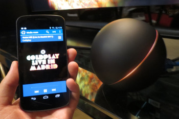
After that, when I went to Play Music and tapped a streaming media icon on the top of the screen, I was presented with the option of streaming to my phone or the Nexus name I’d just created. Because I was hooked up to an HDTV, when I played music, Nexus Q created pretty dancing visuals on the screen–and the LEDs on the edges of the Q’s dome also pulsed in color and in time to the music. You can change the look of the light show by choosing one of half a dozen themes (e.g. warm, cold, blue), make it brighter or dimmer, or eliminate it completely from the settings menu in the Q app. 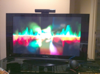 You can add songs to the Q’s queue (pun unavoidable) or play them immediately by tapping on options in a menu that appears when you tap a track listing. You can fiddle with the queue, moving or deleting tracks, by tapping an option in Play Music. To play YouTube videos, you go through much the same routine after tapping the Android’s YouTube app. You are already signed in to your Google account, so accessing favorites and new videos on channels you’ve subscribed to is a breeze. Quality was good, at least while the Nexus Q was connected to the network using the ethernet cable and powerline switch. I didn’t download any movies or TV shows to check out how well the device works with the Google Play movie and TV app.
Guest Access Proves Elusive
So far, so good, but it was all downhill from there. I’m not sure what the issues are, but my colleague Mike was never able to put his Google Play music in the queue–and when we disconnected the ethernet cable to try connecting the Q via Wi-Fi, things really went south. Here’s how it’s supposed to work. In the Nexus Q app, I made sure a setting authorizing guest access was set to On, then tapped a link that created an e-mail message inviting Mike (using his Google account address) to play his music on my network. Mike got the message, which instructed him to download and install the Nexus Q app on his Android 4.1 phone. He then ran the app, which searches for existing Nexus Q devices. Once you find a Q that has granted you access, you can go to Play Music to add tracks to the queue via a pop-up menu and a streaming media icon, the same way I could from my phone. But the Nexus Q never showed up as a streaming device on Mike’s phone. He also got repeated messages saying the My Home collection and/or the Q itself was unavailable.
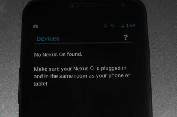
And while we were doing the testing, my own ability to stream music was intermittently impaired. A troubleshooting guide suggested connecting the Q to the network via its built-in Wi-Fi, so I disconnected the ethernet cable and rebooted the Q to start from scratch. But while I was able to restore its factory settings, setting up my 802.11n Wi-Fi network as the Q’s connection proved difficult. I rebooted several times and reinstalled the app a couple of times before the Q mysteriously began streaming the same music it had effortlessly played with the ethernet connection. Even after that, the app intermittently would show the Q as being unavailable one minute and available the next. I live next to several high-rise apartment buildings in downtown San Francisco, and my guess is that the difficulties I encountered relate to 2.4GHz network overcrowding. You also need a router that can handle Wi-Fi multicasting so that the Q can connect to your router while other devices can connect to the Q; Google’s documentation already shows several incompatible routers. Mine wasn’t among them, but I suspect that it was too difficult for the network to sustain the multiple Wi-Fi connections required. I’ll repeat what I said in my earlier post: Google should have included 5GHz 802.11n support. Still, Mike and I were at a loss to explain why he couldn’t play any of his music on the Q–even when my collection and the Q both showed up as available, the Play Music app never displayed the Q as a streaming destination.  Hopefully Google will work on these issues before it begins selling the Nexus Q to the general public. But even if you’re an Android fan willing to spend the $299 on a device with fairly limited functionality (it could at least have supported streaming media from other local network devices), I wouldn’t recommend the Q to anyone who is planning on Wi-Fi only connections in a city or a neighborhood with lots of Wi-Fi networks in range. That’s just asking for trouble.

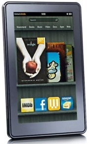 The current generation Kindle FireKindle Fire gossip is almost as common as iPhone and iPad rumors. Lately we’ve been hearing a lot about a new Kindle Fire tablet, which may arrive as early as next month. The rumored new model will be the successor to the first-generation Fire that debuted less than a year ago, and not a moment too soon–the impressive specs of the just-announced Google Nexus 7 make the original Fire seem pretty dated already. Want more rumors? Here ya go: Before the end of 2012, Amazon will unveil its first 10-inch color tablet, one likely designed to go head-to-head with Apple’s dominant iPad. BGR
 LinkedIn, the professional social networking site facing a $5 million-plus lawsuit for a massive breach earlier this month, may win its impending legal battle. But victory will probably not come cheap. Legal bills mount up quickly, especially with an “aggressive” defense, which LinkedIn has promised. Unless the suit, filed on behalf of lead plaintiff Katie Szpyrka and a potential cast of millions of other coplaintiffs, is settled quickly and quietly, it is likely to provide regular public reminders, for months or possibly years, of what happened and why. That, as marketing people say, is not good for “brand identity.”
 There are numerous examples of breaches of companies that are in compliance, which makes it much more difficult to prove negligence. Indeed, the Oregon Supreme Court recently struck down a

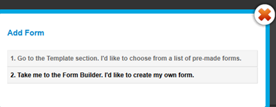
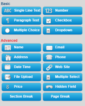
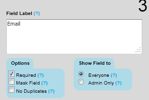
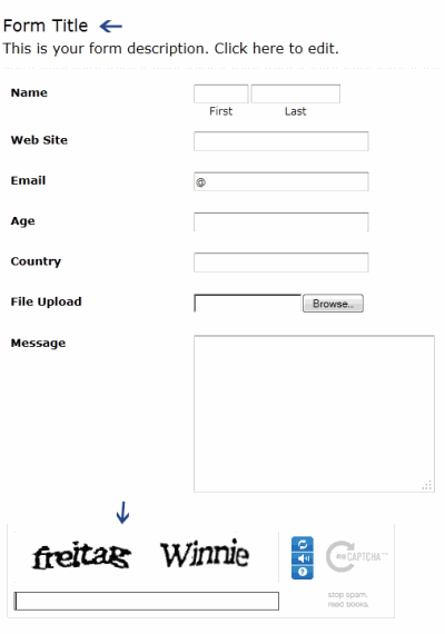
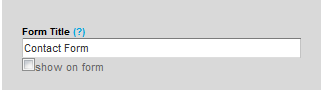
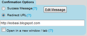












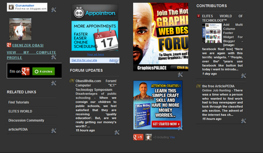
 You can observe that there a total of four columns by default and you can add as many widgets as you want to each column. If you wish to increase or decrease the number of vertical columns then follow the steps below.









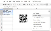
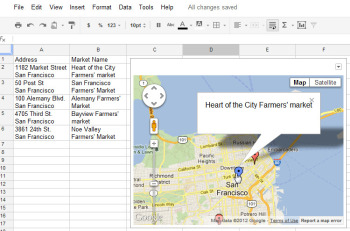 The Map gadget uses content from Google Maps to display the addresses you have entered as markers on the map.Pictures convey more information than words do, and a map offers the easiest way to show people where your office and other places of interest are located. The Map gadget lets you create a custom Google Map with pointers to the places you want to highlight, and it’s simple to use. To begin, type a list of addresses, one per row down a single column. If you want a tooltip to appear over the map location when someone hovers over the marker, type the text for this item in the cell to the right of the address. For example, to produce a map of local farmers’ markets, type each address in one cell and the name of the farmers’ market in the adjoining cell to the right. Choose Insert > Gadget >Maps, and click Add to Spreadsheet. Now select the range of cells containing your address and tooltip data, and then enter a title for the map in the Title box. If your data includes tooltips, select the Last Column as Tooltips checkbox, and then click theZoom Using Mouse Wheel checkbox. From the ‘Map type’ list, select the type of map–Normal is a good choice–and then click Apply & Close. The gadget dialog box will now show a map with the addresses plotted on it. As with the other gadgets, you can publish the Map gadget for use on your website to show your business locations or places of interest to your customers.
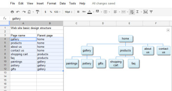 The Organization Chart gadget can create a hierarchical chart showing the design for your website or the management structure of your business.
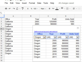 At its simplest, the Table gadget lets you filter data to see a subset of it.The Google Table gadget allows you to analyze data by creating a table that supports filtering, grouping, and even totaling. Insert the gadget by choosingInsert > Gadget > Tables > Add to spreadsheet. Select the range containing your data, including the heading row, and click OK. Click in the Title box and type a title for your tables. Select the checkboxes for Show Filters and Enable Grouping, and then click Apply & Close.To group the data by the contents of column A, for example, click the Define groupings and calculations link, select that column’s heading, and click the arrow to add it to ‘Group by Box’. Click Next, and select a column to calculate. To sum Profit, for instance, set the Profit entry to Total. You can apply calculations to multiple columns, if you desire, or to none at all if you just want to group the data.You’ll see a table appear in the gadget dialog box, with the headings over each column. Use the filter box at the top of each column to filter that column of data. Click OK, and the gadget will show you the grouped data, with any calculations appearing in the row above the appropriate group. You can collapse and expand the groups as necessary to see the values in the table.
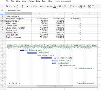 The Gantt Chart gadget illustrates the tasks in a project and the time allotted for each of them.You can use a Gantt chart to display projects involving tasks that must be performed over time. To make this type of chart, you need three columns of data (with an optional fourth column). In the first column, place a list of the individual tasks in the overall project–the steps needed to create and publish an email newsletter, for example. In the second column, place the start date for each task; in the third column, insert the end date for the task. If you wish, you can add a fourth column containing the percentage completed for that task. To produce the Gantt chart, chooseInsert > Gadget > Charts. Locate the Gantt chart and click Add to spreadsheet. Select the data for the tasks, the start and end dates, and the completed percentage, and click OK. Set the Name column to the column containing the task names. Set the Start column, Finish column, and % Complete column to the column letters containing that data (typically columns B, C, and D), and click Apply & Close. The Gantt chart will present the tasks to be completed, their start and end dates, and the progress made toward their completion to date.
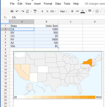 The Heatmap gadget shows relative values as colors on a map.You can plot data related to states or countries on a heat map, with small values indicated by light colors and larger values rendered in darker and more saturated colors. To plot the data correctly, you must use ISO country codes (or, for U.S. states, the usual two-letter state codes). Place the data to plot in the cell to the right of each relevant state or country. Choose Insert > Gadget > Map > Heatmap, and then click Add to spreadsheet. Select the data–including the locations and the data to plot, but not the column headings–and click OK. Type a title for the heatmap in the Title box, select the map type from the Region box (click USA to plot data on a United States map), and click Apply & Close. The map will appear with the regions colored appropriately for the value of the data associated with each.
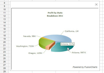 Drag on a pie slice in the animated pie chart to offset it from the chart itself.Interactive charts are more interesting to look at than static graphs. You can create animated pie charts in a Google spreadsheet using a gadget. For this chart, you need only the categories and one set of data, because pie charts can plot only a single data series. Insert the gadget by choosing Insert > Gadget > Charts. Locate the FusionCharts Pie & Donut Widget, and click Add to spreadsheet. Click in the Range box, select the data to plot–omitting the column headings–and click OK. Now select the chart type, such as Pie 3D. Type a caption and subcaption for the chart to inform the viewer as to the information the chart is intended to convey. Enable the Animate checkbox, and, if you prefer, enable Values On and Labels On to show both labels and values for each pie slice. If you enable Tooltips, the mouse pointer will show a tooltip if the user hovers the mouse over a given slice. Select Format Number and set Decimals to No Decimal so that numbers will be constrained in size. Enabling Shorten Values will ensure that the chart presents large values legibly. Click Apply & Close. When the chart appears, you can drag on a pie slice to explode it from the chart. Right-click the chart and click Enable Rotation so that you can then rotate the chart with your mouse. Gadgets such as these add a range of extra functions to Google spreadsheets, allowing you to do new things with your data and display it in ways that can help your business.

 For future purchases, though, Android was clearly the preferred choice, with 44 percent of respondents saying they’d choose a device that uses the Linux-based operating system. Only three percent of respondents said they’d opt for Windows 8, and 21 percent said they weren’t sure. Global Variations The research results are even more interesting when broken down geographically. In Africa, 44 percent indicated they’d choose an Android tablet, compared with only 21 percent planning to buy an iPad. Similarly, in Europe, 23 %of new buyers said they plan to buy an iPad, compared with a full 49 percent who have set their sights on an Android tablet. North America and Australia/New Zealand, interestingly, showed the lowest preference for Android tablets, only 30 percent of North American buyers and 35 percent of those in Australia/New Zealand choosing them over iPads.