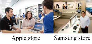
Apple and Samsung have been locked in unceasing patent battles over their offerings, and now some people are accusing Samsung of even ripping off the design of Apple’s retail stores. But Apple doesn’t own the corner on using an open floor design and it certainly didn’t invent the idea of minimalism. And any retail store that sells phones and gadgets is going to have tables for playing with them. Microsoft stores do. Samsung recently opened its first North American retail store in Burnaby’s Metropolis at Metrotown, Vancouver, British Columbia and it can’t be denied that it does resemble an Apple Store with its open floor space, demo tables, and blue-shirted staff. But is Samsung intentionally copying Apple Store design?
 Image compilation from Apple/Vancouver, B.C. Sun
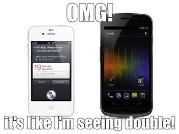
 Image from BetaNews.com Apple uses wood tables and Samsung has gone with white. Big deal? Not really. From what I’m seeing, Samsung’s store looks similar to countless exhibits you’d see at CES. As for the blue shirts that both Apple Store and Samsung Store employees wear, it’s worth remembering that Samsung’s company color is blue. This is hardly the first time Apple and Samsung have tangled. The former managed to get the latter’s Galaxy Nexus smartphone and Galaxy Tab 10.1 pulled from store shelves recently. A graphic from BetaNews’ Joe Wilcox is a great summation of the attitude many people have regarding Apple’s incessant insistence that other companies, Samsung in particular, are ripping it off. What’s your impression? Does it look to you as if Samsung intentionally cloned the Apple Store in its new retail location?