Does the cluttered ribbon menu in windows 8 annoy you? Ian Paul – PC World will tell us exactly how to clean it up.

When it comes to Windows, there is nothing I love more than Microsoft’s infamous Ribbon interface—and nothing I hate more. Using it in Microsoft Office is great, but adding Ribbon to Windows 8’s file explorer was a bit much for me.
So I decided to pare File Explorer down a little and put the features I might need front and center, while banishing the rest of the Ribbon from my sight. If you’re tired of dealing with a Ribbon-loaded File Explorer, here’s a quick way to simplify your menu hopping.
 |
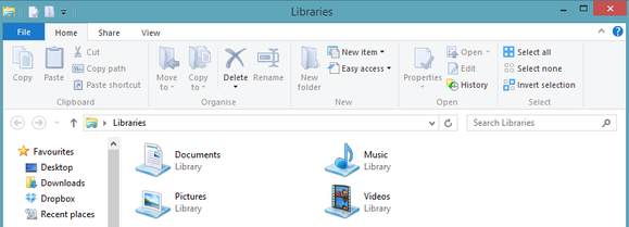
| The Home tab of Windows 8’s stock Ribbon interface. |
But first…
Before we get going, let’s run down some basic anatomy of Windows Explorer. At the very top of the window you’ll see a file folder icon in the upper left corner. Next to that are a few icons and a downward facing arrow. That small set of icons is known as the Quick Access Toolbar (QAT).
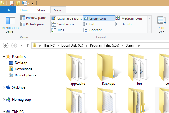
Below that, where you see menu options for File, Home, Share, and View—each with their own mess of icons—is the infamous Ribbon we were talking about earlier.
And now, on with the show…
How to clean up the Ribbon interface
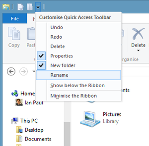
First, click on the QAT’s downward arrow to show the functions you can add to the Quick Access Toolbar, including undo, redo, delete, properties, new folder, and rename. Some of these should already be selected. Add the feaures you use on a regular basis; they should appear in the QAT immediately. Fear not if you don’t see a beloved function: The QAT can have any Ribbon UI feature you want. To add your favorites, just right-click the option in the Ribbon and select “Add to Quick Access Toolbar” in the pop-up menu that appears.

That’s it! Now that you’ve got your QAT fine-tuned, it’s time to give it a more prominent placement and banish the Ribbon UI. Right-click the Ribbon and select “Show Quick Access Toolbar below the Ribbon.” Next, right-click the Ribbon again and select “Minimize the Ribbon.”
Windows 8’s File Explorer should now look similar to what you see below, with the Ribbon pushed to the background as much as possible and the Quick Access Toolbar front and center with all your favorite menu options.
Forgotten, but never gone
The Ribbon may be banished, but it’s not gone for good. Anytime you need to access the Ribbon, simply click on the menu option you need (File, Home, etc.,) and the Ribbon interface will briefly reappear. If you want the Ribbon back permanently, just right-click the Ribbon’s menu options and deselect “Minimize the Ribbon.” You can put the QAT up at the top again by right-clicking it and select “Show Quick Access Toolbar above the Ribbon.” These few simple steps can make File Explorer a lot easier to use—and a tiny bit closer to the standard menu interface found in previous versions of Microsoft’s OS. The same basic procedure can help you clean up Microsoft Office’s Ribbon UI, if you consider it an eyesore, too. I hope it helps! Full credit to this article goes to Ian Paul and PC World